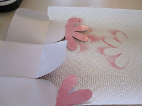
Having a blog really is a lot of fun. ShesASassyLady keeps growing each week and it's because of the awesome projects the Sassy Designer team shares with you daily. But you know what? It's not all peaches and cream! We make bloopers and lots of them. I thought I would just share a couple of mine with you just from this week!
As you know I have started the weekly Card Kit Giveaway and it seems very well received and I am always amazed at the ratio of file downloads to actual entries. The downloads always out number the entries by at least double, sometimes triple. Guess that means I need to do a better job choosing my paper! I try to Sass it up but I have learned to really think out the colors before cutting. I will try harder and you will see the difference in the future.
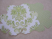
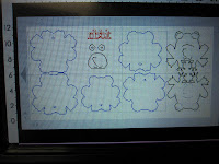 This little Froggie is adorable and is a salvaged design! He won't be a part of the card kit giveaway at this time. Who knows, maybe with a complete over haul! You see first I designed him way too large for an A2 card. You can see from this photo that he is almost 11.5 inches high. I know better yet for the life of me I can't tell you what I was thinking. Then I choose this beautiful paper and figured I would place his base body layer on that so you could see this lovely green at the base and was I shocked when it cut the exact same size as the base without offering a smidgen of paper. This gave me two extra pieces. I also was going to place ribbit inside the card but made that almost as large as the inside of the card. This offered no room for a message to the receiver. Before cutting I made size adjustments and actually cut 2 sets. My color choices were fine and I actually bagged the card set thinking, yup I can offer this.... Then when I started putting it together I knew there was no way this card would ever make the cut so I decided the best thing to do is SALVAGE IT as it looked OK. It was just too much work to get it to line up properly and a Sassy Giveaway should be easy for the receiver to put together. GIVEAWAY REJECT.
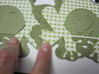
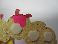 Here is another SALVAGED card. I cut out this project that I designed and the file was fine but the cut.... it didn't do very well at all. You see I didn't think it out and used a light textured paper on the parts that I should have used card stock on. So I had to cut another paper to back the paper that I chose. Then my first color choice just faded into the background so I used some scraps as my first color choice turned out looking terrible. I should have measured the scraps better as my body cut was missing a few pieces... legs, antler, belly. Thank goodness my little caterpillar had an outline to cover some flaws. I even pieced it together with a pink post it note on the back! The card turned out cute but was a GIVEAWAY REJECT.
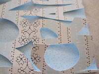 This one is a TOTAL REJECT at this time. I am going back to the drawing board with it as it was not even salvagable. I love the design so it will be reworked. I welded the words together missing the bottom of the R and A. The card would never hold the open and closing multiple times before it just fell apart. I thought of backing it but the fold itself was too weak so I will work on this in the future. It will say don't be crabby! And we all know people we can give this card to.
I cut all of these bloopers in one day! But the great news is I also got a good project completed.... a set of 4 note cards and matching envelopes and a successful giveaway card that is scheduled to run on July 12th, so be sure to look for it. (I will confess I had a blooper on it as I inked the wrong side so I just cut 1 little piece). And I walked away with 4 new cards that I will keep for myself as they did turn out OK they just took the long way around and weren't good enough for the weekly giveaway!
My whole point for this post is to SALVAGE what you blooper and don't be afraid to show it off. If I didn't show you those ripped off antlers you would never have known. Look at the photo above left, see it is perfect. Hold your head up and be proud of the project you made because no one will know that that is not how you originally designed it!
TIPS To Remember-
In no particular order.
- Choose not only the color of your paper but the weight. It is difficult to make a light weight cut look good when you use a pop dot!
- Keep plenty of stickles on hand to hide mistakes. Over spill of glue is hidden easily with stickles.
- Make sure you have all your supplies as if you make a blooper you are more likely to toss than salvage if you don't have all the supplies needed to finish.
- Measure while designing.
- Make sure you have all layers and not duplicates of the same.
- Measure before cutting.
- Check your paper position on the mat before cutting... you could have it upside down.
- Further clarify your load mat and paper by keeping the Gypsy mat in front of you and pay attention to the arrow on the Gypsy and load the paper on the mat the same way.
- Make sure you have a good blade in your Cricut.
- Before changing your blade first check it by removing the housing and then push down on the bottom so the blade pops up and blow out all the excess debris. Often times this will make for a better cleaner cut.
- If using a Gypsy make sure all the carts you used are linked.
- Make sure you insert your mat in the right direction.
- Make sure you use the right glue/adhesive for your project.
- Store your little pieces in a baggies or on drywall joint tape so they don't get lost.
- Test cut with maybe a cheaper but heavier cardstock like walmart's especially if you are cutting intricate cuts and also when the cuts go lower than 2-3 inches.
- Use a better quality paper while doing the actual cuts.
- Always keep the speed at low as the Gypsy does make the cricut go faster.
- When using a Cricut Marker be sure to place a small sheet of paper under the blade housing so your designer paper does not get marks on it.
- When using a Cricut Marker be sure not to move the blade housing while changing from the blade to the marker in the middle of a cut as your marker lines will not line up to you cut lines.
- When using a Cricut marker remember not do remove your mat between cut and write.
- Make sure your cut has gone through before removing from the Cricut so that if you have to make a second cut it will line up properly.
- Always make sure your mat is clean and free of particles before cutting to avoid ripping or jumping on the paper.
- When cleaning your mats I find that Dawn and a scrubby seems to work the best to remove built up glue. Then just apply the Zig two-way glue and let dry overnight.
- Invest in Drywall Joint Tape at Walmart for around $4 you can take your headings off your mat if they ar not welding and place them on your layout while retaining the correct spacing.
I am always encouraged by your sweet - sweet words. Your comments inspire me to keep scrapping and sharing things with you.


