 Isn't this a lovely layout? I just love when I have a layout that I can use four photos on it. I used French Manor and Summer in Paris for this along with my Cuttlebug to prepare the mats for my photos. The sketch is from Jana Eubank and is simply elegant, don't you think? This layout was made for a lovely lady and I must admit I will probably make another to use with a different title and filled with family photos.
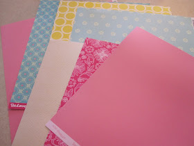
Look at these lovely papers! They are all Cosmo Cricket paper and wow are they nice to cut with.
I had to take a close up of the paper so you could see the sheen in the paper, isn't it awesome? I used it to make the scallops edge and the photo mats on my page. They were cut from the French Manor cart page 56 the scallop border. I welded two together to form this beautiful border edge.
The flowers were made from French Manor. I made them in 5 different sizes and altered print and solid paper to make them appear to have more dimension. I turned the edges up slightly and held each layer together with a large glue dot to add even more dimension. for the center of the flower I used Zip Dry glue as it is clear drying and applied 16 to 20 tiny pearls to form a 1/4 inch center of pearls in each flower. Didn't they turn out awesome?
Here you can see a close up of the photo mats allowing a beautiful embossed edge with help of the Swirl folder and my Cuttle Bug.
I applied 7 pearls to each scallop, and in this photo you can see how nice the flowers look.
Here is another close up. Since I was making this for someone else I took plenty of photos.
Don't you just love the pearls on this layout?
Here is another closeup of the pearls and a flower.
I hope I am not boring you with these closeups but I really like the paper on this and it was so hard to get a good photo of the shimmering effect it has.
Here is a good close up of the light hitting it just right.
Well I sure hope you like today's project. I am kind of sad to see it go. Thank you for joining me today and for your sweet words of encouragement. Your comments continue to inspire me to share with you.


Sheila,
ReplyDeleteI love your layout. The colors are so pretty. I really like how you added the pearls as well.
Thanks for sharing
Hugs
Stacy
That's gorgeous! The lady picked the right person to do her layout.
ReplyDeleteSoooooo pretty!!!!!
ReplyDeleteThis is BEAUTIFUL I love all the pearls you used.
ReplyDeleteBeautiful page! I love embossing and cutting with that Core'dinations cardstock! So awesome!
ReplyDeleteSheila, it's just beautiful!!! And the embossed swirls and soft colors, the pearls -- Oh, it's simply beautiful!
ReplyDeleteThis is stunning! I love the papers, embossing and all the pearls!
ReplyDeleteOh my this is gorgeous! I love the embossing - what a beautiful touch!! The pearls are just an amazing pop on this page too...love it!
ReplyDeleteOh my goodness, Sheila!! This layout is absolutely beautiful!! There are so many gorgeous details!! I can see why you took so many pictures! I would have a hard time letting it go too! So glad that I saw this today!! Thanks, as always for sharing such a wonderful creation!!
ReplyDeleteThis is gorgeous.So elegant and delicate
ReplyDeleteBeautiful LO!! I love all the texture and pearls!!
ReplyDeletebarb :)