Hi there! This is Melody again from A Splash Here and There blog. Thanks Sheila for having me over once a month.
Today I’m sharing a few 3 3/4 x 8 inches cards with basically the same images but each done up a little bit different. Why the odd measurement you asked? Well they were originally meant to fit into letter sized envelopes but as I decorated them they turned out to be a little (a lot, really) too bulky for them. No worries though because I was able to create envelopes for these bulky cards.
This project was designed using the Silhouette Studio using images purchased from the Silhouette Store. I started out by creating a base card measuring 7.49 x 8 inches (shown below in green). Then I centered a perforation in the middle of the base, where I would want the card folded in half. I created a mat for the front of the card (shown in pink) by sizing a rectangle 3.5 x 7.75 inches. For the front panels (shown as the black layer), I used the internal offset feature and sized them at 3.25 x 7.5 inches.
Then I took this front panel (again, the size flood-filled in black), and sized the assorted ballerina silhouette (these came in a group!) by Jamie (Design ID #32539) to fit inside.
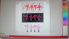
And here are the three different front panels in my Silhouette Studio, before sending them to my wide format printer and cutting with my Cameo. The registration marks on the screen are the same ones that the Cameo will use to cut where it needed to cut.
The background on the top one was flood-filled with the butterfly pattern by Olivia (Design ID #21069). The background in the middle was flood-filled in black, while the same ballerina silhouette was printed in pink, as a sketch. For the bottom one, I used the same ballerina silhouette done up in sketch, but left the background clear. I used the Times New Roman font for the “SOAR” sentiment, and used the sketch feature to print it in black. Below is a closeup of the front panels, after printing and cutting.
And here are closeups of the finished cards again, after embellishing them with premade ribbon rosettes, sticker gems, faux stitching with gel pens and embossed (Plum Blossoms CB folder) strips in coordinating colors.
Now there is plenty of room for each bulky card


Meloday, your cards are beautiful!!! I love the dimension!
ReplyDeleteThese cards are gorgeous. Thanks for providing all the detail of how they were made.
ReplyDeleteThis is a wonderful card. Love the design and the great colors you chose. Thanks for sharing with us today!
ReplyDeleteBeautiful cards! So elegant! Thanks for the great tutorial!
ReplyDeleteThanks ladies! ;)
ReplyDeleteWOW three fabulous cards from one style. Love it!!! And the envelope is gorgeous. TFS
ReplyDelete