April 30, 2015

A Note For Nick

Good morning - Adrienne from Eagle Canyon Arts.  It's always a pleasure to be a part of Sheila's talented Sassy Lady design team.  Thank you, Sheila.

April's Stamp of the Month (SOTM), "Typed Note" (S1504) turned out to be a perfect match for the birthday card I wanted to make for our nephew Nicholas, a senior in college.  Although computers are "de riguer" these days, the typewriter evokes a whimsical feeling of nostalgia and masculinity for this card for a "Twenty-something" fellow. 

Other CTMH Supplies used: 
Tommy papers (retired) 
Mini Medley Accents (retired)
Outdoor Denim (Z2140) and Cranberry (Z2116) Inks
Inside the card, a simple sentiment with a vintage helping hand.  I love this stamp!  Hope you enjoyed this project as much as I enjoyed sharing it with you.
Blessings,
Luke 14:15-24

April 28, 2015

Feel Better

Hi everyone...It's Sonya from Sonya's Paper Trail, and do I ever love the card I'm sharing.  It was a Pinterest inspired design, but totally adapted for the colors I like. It's always good to keep an eye out for layouts you like, but then adapt the colors for your preference. 

 Check it out:


I started with my Cameo and designed the basic background of the card.  I started with a standard mat in the polka dot paper, then layered three banners in the floral print.  The doily was a cut from the Silhouette Online Store.  Rather than edit it, I cut a full circle, then simply sliced it in half with my trimmer (and used the other one to make a second card!).  The butterfly is also from the Silhouette Online Store.  I added a few glitter pearls for the body of the butterfly.  The stamped image is by PTI from the Mega Mixed Messages stamp set.  I added a Prima and a glitter brad to finish off the card.  The papers were all scraps in my bin.  Scraps have never looked so pretty!

I hope you have a great day! 
 
Cheers,
Sonya

April 27, 2015

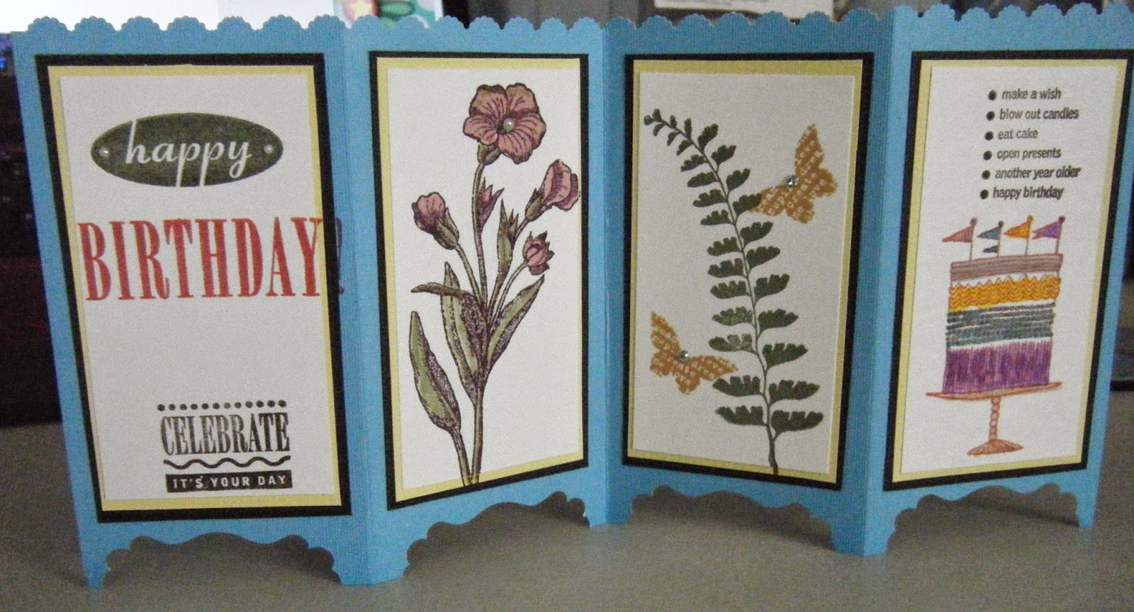
Screen Divider Card with Envelope


Hello my fellow scrappers,

Lisa from Lisa's Craft Room here to share another project for the month. I saw this card on Dawn's site and fell in love with it. I love cards that are different and this card can be made for so many different occasions. I made it for a friend's birthday.

It starts off with card stock measured at 5 1/2" x 11". You need to cut 4 each of layers of colors of your choice, the card stock, I used blue, for the layers, I used white, measured at 2 1/8" x 4", yellow, measured at 2 3/8" x 4 1/4" and black, measured at 2 1/2" x 4 3/8".

The base of the card, score it on the landscape side, (the 11" side,) at 2 3/4", 5 1/2", and 8 1/4". Fold the card in half and put a pencil mark at the bottom of the score line to use as a guide for punching a border. I used a scallop border. Then you can fold the card, mountain and valley folds. On the bottom, the decorative label punch was used to create "feet" for the card to stand.

Then you decorate the top layer of each panel and adhere them together and then to the base and you have this darling card. I just love it. "Thanks Dawn" :)

The envelope was made on the envelope punch board, starting out with a piece of card stock measured at 9 1/4" x 9 1/4", the first score will be at 4 3/8" then you just score each corner from there. I also rounded off the corners. I stamped a cupcake and a sentiment on the envelope.

Well, there you have it, a sweet card and envelope to match. Thanks for stopping by and thanks Sheila for having me for another month :)

April 23, 2015

Thank You

Hello Sassy People!

As many of you know, foiling is very trendy right now! A few years ago, I wanted to learn how to do this technique but the resources were very limited. Fast forward to January of this year, an easier foiling machine was introduced. In my excitement, I researched the price and was disappointed. I told myself I would save up for and hopefully catch the machine on sale. One day I was on Youtube and in my watch feed I saw a video on ways to foil by Jenny M. I watched it and excitement returned! She shared the laminator and laser printer technique and I was intrigued. I had the printer and a YourStory I just needed foil. I went to Hobby Lobby found foil and I was set…so I thought. I tried using the YourStory and it left a lot of black exposed. The results were not horrible, but not like I saw on the video. Then I used my cheap laminator and the results were much better, but not perfect. I think I may need to run the foil through twice. Anywho, here is a simple card I did using this technique. 


I used a file from the Silhouette Store. I brought it on to my virtual mat and filled it with black. I sent it to my laser printer. I cut the rectangle using the Lawn Fawn Stitched die and then ran it through my laminator. 


I layered a piece of foil card stock and that’s it! Not to shabby! One day I hope to get the foiling machine (it does a full 12” page beautifully). Until then, I will work to perfect this method on my laminator! 


I hope you enjoyed today’s project, Kenya~

April 21, 2015

Friendship Card

This A2 card gets my vote for the easiest card I have ever made. I started with an 8-1/2" x 11" piece of patterned cardstock, cut in half width-wise.


Hello Friend, card front

Sentiment

The 'hello friend' sentiment was cut using the Cricut Beyond Birthdays cartridge. I shadowed it in a charcoal gray.

The dragonfly took a little bit of time. This was mostly because I was using a new die and stamp set, and tried to get too fancy with the vellum wings. I do like that they are still transparent, yet with a little bit of veining.


Inside


Since my aim was to make this attractive yet quick, I did not over-embellish the inside. I did however, print a custom message inside. This is easy to do in Word as a text box. 


And while I was at it, I printed my own little logo on the flip side to appear on the back near the bottom (another text box).


Embellishments

  • The obvious embellishment is the dragonfly, of course. Cut twice - once from white cs, once from vellum. I trimmed off the wings from the white one and sponged the body with aqua and light green. Then I adhered the body to the vellum layer. A couple of blue rhinestones finish him off.
  • I chose a ribbon that coordinates with the yellow and gray in the sentiment. Before applying ribbon to the yellow bottom strip, I punched the edge with my MS lattice punch.

I hope my friend likes her card. This one was fun to make!
I'd love for you to drop by my blog at Gracenotes For Today.


April 20, 2015

CURVING TEXT IN EXPLORE and a TIP!


           Hello, everyone, this is Charlotte C.  Thank you, Sheila, for once again letting me join in on your blog.   Today I want to share with you a few ways to create curved text in Design Space with your Explore.  And let me preface all this by saying there are ways to create word art in Illustrator and Publisher and other such programs that can be imported into Design Space, but I’m sticking with only using Design Space and Cricut images. This first part will cut the letters out of your card stock or vinyl in the shape you created (good for stencils).
         Insert a shape you wish the word to follow, like a circle or oval; open the text box and type your word in the text box.
        With the word still surrounded by its box, right click on the word, and left click Ungroup, and now you can move each letter individually.  Oh, but those pesky “handles” make it impossible to see what you’re doing.
        So here’s the TIP:  Create two small circles; position one above and one below the first letter you want to move and group those three together.
         Now you can easily see your letter and can maneuver it where you want because the “handles” are no longer in your way.

When your first letter is in place, ungroup, and move the little circles to the next letter you need to move, then the next, and so on, grouping, moving and ungrouping.  Actually sometimes mine were ungrouping themselves once I clicked off them. 
When your entire word is placed and spaced along your shape to your liking, delete the shape and the two circles you used for placement, highlight your word and click Attach.  When you click Go and your preview mat comes up, you will see that the word will cut out in that shape, and now you’ll use the negative of the cuts to position each letter exactly where you want them on your project.

If you want a single word to cut out rather than individual letters, you will have to weld the letters together to form that word.  As you’re placing your letters around your shape, position them to touch each other.  When you’re satisfied with how it looks, delete the shape, highlight your word and click Weld.  Now your word will cut in the shape you want, like this.

Maybe you want to write on your card stock instead of cutting out the word?  When you’ve first typed your word and it’s inside its box, in the layers tab change cut to write; change to a writing font if you wish.  Now proceed to ungroup and move your letters as above.  It will look like this if you don’t weld the letters. 


You can easily personalize a banner/label by duplicating it and using the duplicate as a guide to placing your word.  I changed the color of the duplicate in this example so I can see the original.  Pretty cool, right?


Thank you for stopping by today.  Enjoy the spring weather we’re finally having, and if you have any questions (I know this post was wordy), please contact me at any time.