October 31, 2011

Treat Bag Tags

Photobucket


Hi Ya'll!  This is Leah, from My Craft and Chat Cafe.  Today I want to share one last Halloween project that my Darling 5 y/o daughter and I were able to do together.  It's super, super simple, but a lot of fun to be able to spend some "crafty" time with your little one.


Photobucket


I used the ghost from Cricut Smiley Cards and omitted the pink circles for the cheeks.  The ghosts were cut @ 3.25 inches using Stampin' Up! Pumpkin Pie, Basic black and Whisper White cardstock.  Anna Claire used repositionable adhesive on the ghost layers.  I assembled as she applied adhesive.  Then, using Stampin' Up! Regal Rose ink, Anna Claire dabbed the ghost faces to make nice pink cheeks.


Photobucket


Next, using a stamp from "Small Talk" a My Creative Time Stamp set, Anna Claire stamped 'From' on the ghost backs and signed her name.


Photobucket


I used a standard hole punch to punch holes in the top of each ghost and attached hemp twine to the ghosts and tied a ghost around each goodie bag for Anna Claire's kindergarten classmates.  She's all set to share her "heart made" goodies with her friends.


Photobucket


I hope you enjoyed my project for today as much as I had spending "crafty" time with my daughter.  Now you make something with your little crafter!  Until next time...


Crafty hugs,
Leah

October 30, 2011

The Kids Corner - Justin Makes A Birthday Card

Hope you are all having a great day. I want you all to meet my 9 year old grandson Justin. He will be showing you how he made this wonderful birthday card for his cousin Brianna. All my grandchildren love to craft and when ever I keep them for the day when there is no school or they are sick we have a craft period.


I sure hope you all enjoy Justin's video and give him plenty of blog love. We love your encouraging words and I am sure your comments will inspire Justin to keep crafting.

October 29, 2011

Gypsy Made Simple - Accordion Ornaments Designed By Bobby Hardgrave - Link Up Your Ornaments Here


Good morning! I am so excited to bring this project to you today. Today I have such a special little project to share with you. Our very own Sassy Dude; Bobby Hardgrave of the Cricut Couple sent me these marvelous accordion Christmas ornaments that he designed just so I could share with you. Thank you - Thank you Bobby from all of us. Now you must check these out.


 Bobby made three individual designs. And each one is so beautiful I just can't get over how nice these are. I hope my photos express how beautiful and intricate these are.

All of these ornaments were created from the CTMH Art Philosophy cart. And Bobby was so kind he even shared the file with us. And for you Design Studio lovers I converted the file just for you!

This is my favorite shape I just love how intricate this one is.
Now I had to cut a set of my own so you can see just how perfect this file cuts. Don't you just love these?

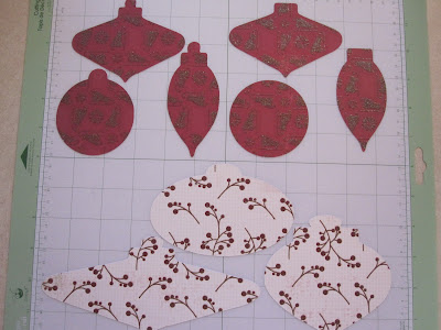
This is my mat before and after the tree ornaments were cut. See how it lines up on the mat and it cut so easy.... I just love cuts like this.

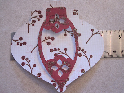
This is just so you can see how the ornaments layout. Notice the one is a full 4 inches wide! They are a wonderful size.


This is a close up of the ornament inside accordion. Notice how it folds?


Now isn't this just too much fun? I had so much fun putting this little project together. Here is a photo of the finished sign. It will  be great for hanging inside the house like in the foyer as an example. I think the colors of this sign go perfect with the ornaments that Bobby sent, don't you?

Isn't this just too cute? There are so many projects that you could make using these wonderful ornaments, I just can't wait to see what you do with them.


Well wasn't that an easy design? The amazing thing about our Gypsy is that we can touch a few little buttons, stretch here, scrunch there and we make magic. This is a great example of that. If you would like a copy of this Gypsy file click HERE. I am sorry but I could not get my Design Studio to convert this file so please follow the instructions and you should be able to make on you own as it is a simple design.
Now I challenge you to make an ornament any kind of ornament and link it up. Make sure you link up your ornaments to this post by 3PM on Friday November 4 and you could win a beautiful personalized monogram note card set (color may vary). The winner will be announced at 5AM on the 5th.I sure hope you enjoyed this project. I thank you for your sweet sweet words of encouragement. You comments continue to inspire me to keep sharing with you. Also please give a big thank you to Bobby Hardgrave of the Cricut Couple for sharing his wonderful file with us.


October 28, 2011

Halloween cards

Hi all,
It's Kelly from Kams Crafty Place.Today I thought I'd share with you some Halloween cards I made. I used the same image and just changed the card sketch and the way I coloured them in.

I used a stamp by Sugar Nellie. It's simply Sassy Witches Cauldron. You can but it from Funky Kits. Just to warn you they have a lot of nice stamps.


I couloured them in with my promarkers. You can see I used the same colours and just changed around which bit was purple etc.
The Promarkers I used are -
Violet, Amethyst, Auergine.
Pumpkin, Amber, Mandarin.
Holly, Forest Green, Green.
Blush, Vanilla.

Black, Cool Grey 5.

Here are the finished cards.


I hope you liked the cards I made. Thank you Sheila for having me as a designer today
Kelly x

October 27, 2011

The Total Package...

Hey Ya'll,
Sassy Dude here again.  If you want to check out some more from us, just pop on over to Cricut Couple!  We love all of our wonderful visitors!  I called this project "The Total Package" because I have been getting a lot of requests lately for an explanation of how I make my envelopes and envelo-boxes.  This is great fun for me because I am going to share with you my second favorite tool!  Here is the project for this month!
 So... my absolute second favorite tool is by far, the Ultimate Crafter's Companion (further mentioned in this post as "UCC").  I got mine a LONG time ago on HSN.  For what I am showing today, you can also use the Crafter's Companion Enveloper as well.  It's the exact same thing as this one side, but with the Ultimate Crafter's Companion, you can do so much more.  It comes with tools, scoring boards, card maker, embossing templates, cutting blade, mini-bow maker and more.  This one costs around $40.00 and the Enveloper costs around $15.00.  The best part about it is that it comes with a DVD with instructions for making tons and tons of cool stuff!  OK... was that good enough for the commercial?  Hee! Hee!
 The UCC comes with a complete instruction book with directions and measurements of everything you need.  The card that I made is the basic 1/4 card size, so I needed to make an envelope to fit.  The cool part about the UCC is you can make an Envelobox.  Since the card I made is an easel card that is pretty thick, a standard envelope will not work.  Since I have a 1/4 card, I need to figure out what paper I need and where to score.
 This is the A2 section....  So for a quarter card, I have to start with a "Square" piece of card stock that is cut 8 1/4" x 8 1/4".  To score on the board, I have to use score lines D & F.
 So, using a straight cutter, I lined it up at 8 1/4" and cut it down to the square size that I needed.
 This is what the board looks like on the Envelope side.  Note: If you have the Enveloper, this is all that you would have anyway.  It's just this single section of the board.  You can see in the picture below where I highlighted lines D & F.  To start, I have to score this corner at line D.
 So below is where I scored the line D.  BTW, the tool comes with a folder and scoring tool.
 Now, since I am making an envelobox, I have to have that little extra edge for the thickness of the card.  That's what is so cool about this tool.  On the right side of the picture below, you will see that there is a second groove in the corner.  SImply slide over the card stock into this second groove and score line D again.  It's that simple.
 In the next picture, you will see that you repeat the same thing with line F on the next corner.  You can see the original score lines at the bottom of the picture.  One thing to remember is that you score D across from D and then F across from F.
 The most important thing to making envelopes is that the score lines cross over each other.  If not, you will not get the pocket.  The corners would be open.  For the enveloboxes (and not standard envelopes) you need to cut out the corners where the score lines cross over.  This will allow you to have nice clean corners and make it much easier to fold.  You can see below how I cut the corners.  I also need to mention that I added a scrap piece of card stock from the card I made to use as a liner for the envelobox as well.
 Once you know which end will be the flap on the envelope, I use a rounded corner punch for the tip.  Sometimes, if they are for a very fancy card, I will use a Martha Stewart Corner/Border punch combo to make a lacy edge to the closure as well.
 Fold everything on the lines and you will see below what you end up with.  The bottom flap in this picture is where you add adhesive.  You want to add just a line of adhesive from the edge to the tip of this one part.
 The best method I have found for this is 1/4" ATG tape, so I just used my ATG gun for this part.
 Below is what the card looks like from the other side once corners are cut and the tip has been punched.
 Once you have your ATG on, fold in both sides, stick the bottom flap to the sides and then fold in the remaining corner as shown below.  I always use my folder tool and press this very good and everything is stuck and done!  If I am someone has ordered a card from me, I will use scrapbook adhesive squares that have the tape tabs on them.  This way, they can personalize the card and still stick it closed.  I have never liked the lick and stick glue, so I don't use it.  If I am giving this card, once it's ready to go, I will use ATG on the top flap to close it.  If it's very fancy, I sometimes use a two slit punch on the tip of the top flap and the bottom of the opening (where it's folded over) and feed through ribbon.  This way, when the envelope is closed, it has a pretty bow.
 Once the envelobox is complete, I use scraps from the card papers and make a label to write the recipient's name on it.  A lot of times, I will use a rounded corner punch or a Martha set.  For this card, I kept it all straight and simple and inked it to match the card.
 Now, for the card.  This is very easy to do.  This is an easel card that I made.  I also used the UCC for making the card.  For this size, I used an 8 1/2 x 11 piece of craft card stock.  I sliced it down the middle-long ways- in order to get the larger piece.  This makes it 4 1/4 x 11.  The next piece is 4 1/4 x 5 1/2.  This is for the front of the card.  The card board on the other side of the UCC breaks things down in halves and quarters rather than measurements.  I scored on the half US letter and then on the Gate Fold Line for Half US letter.  This makes the bends for the card.  Then I used ATG to tape together the top with the base.  You can see how this card is hinged in the pictures below.
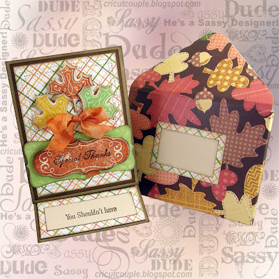
 For the front, the base mat (Chocolate) is 5 1/4 x 4.  The plaid mat is 5 x 3 3/4.  I used CTMH-Art Philosophy for the leaf cuts and the sentiment.  I also used the stamp sets.  The cuts were made based on the instructions on the stamp set.  I used a Thank You set of stamps from Inkadinkado for the sentiments.  The bow was made using Marmalade Crinkle Ribbon from My Craft Spot.  Everything is inked with a cocoa ink on all edges.  On the left (picture above) is the front (cover) of the card.  The top right is the inside of the card.  The bottom right is what it looks like standing up.
 The picture above shows what they look like next to each other showing off the inside lining of the envelobox.
You can see now how such a thick card just fits perfectly inside since that extra edge is put on the envelobox.  Well, we sure hope you enjoyed our little tutorial today.  I hope the instructions are clear.  It's such a difficult thing using the camera and typing it all out. I have NO idea how to use the video camera or I would have tried to make a video for this.  Hee! Hee!  We would love to hear your comments today.  We also wanted to say a big THANK YOU to Sheila for letting us play today!

October 26, 2011

Halloween Sign

Hi everyone, Beth from thunderbirdlindybydesign, today  I wanted to show you a quick Halloween sign I made.  I got the idea from a wooden sign I saw at Hobby Lobby.

You will need:
Ribbon
Circuit Expression
Cardstock(I used regular, glittered, and shimmer)
Happy Hauntings Cart
Oct 31
Heritage
George, or any cart with an oval
Glue
I also used my Gypsy, but after I got it done, I realized you did't need one.

I started with Heritage and cut the scroll sign at 11.39 high using glittered black cardstock.


I started with the oval from George at 7.24, using shimmery cardstock and placing the following cuts inside of the oval, I cut the house from Oct 31 at 3.39
The Bats from Happy Hauntings at .30
The moon from Oct 31 at 1.12.

In hindsight, I could have just cut the oval by itself, and then in black cardstock cut the House, Bats and Moon, and glued them on top of the shimmery instead of trying to place the cuts within the oval.  After I got it all together, I realized I made this harder than it needed to be.

Using Happy Hauntings, I cut both of the above pumpkins with their layers in various sizes.

The owl and it's layers is from Happy Hautings cut at 4.18.
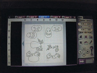
Like I said, you really didn't need your Gypsy, I just started placing the items I wanted to cut on the screens and sized them to each previous layer.

Here is the completed project.
When I put the above pumpkin together with his layers, the whole time I kept thinking of the line from the movie Toy Story, when Mrs. Potato Head was packing Mr. Potato Head's butt, and said he needed his "Angry Eyes".  Boy this pumpkin sure has Angry Eyes.


I wished I would have cut the scary top layer in black instead of grey.  I am not liking this too much.


Thanks Sheila for having me as a guest designer today,  Beth.