Hi and Happy 2011!!! I am Lori Apgar from ScrappinMyStressAway and I am so excited to be Sassy today!! I created this layout to highlight my Top 10 events from 2010.
I started out by putting a rectangle on my mat from George and unlinking the Aspect Ratio Link (the chain between the Width and Height on the Basic Menu). I changed the Width to 0.62 and the Height to 12.00. I copied it and moved each rectangle to either sides of the mat. I copied another rectangle and rotated it 90 degrees. I copied one more and moved one to the top of the mat and the other to the bottom of the mat.
I made another copy and positioned it at X5.74 Y-3.16 to create a border on the bottom of my layout. I grouped and welded the 5 rectangles. ***At this point I save my project as lo.frame.3(I have two similar versions saved already). The next time I want to make a similar layout, I have the basics ready to go.
I used the "ten" border on Graphically Speaking and stretched it to 11.25w x 2.25h. I moved it into the border space and welded it. ***Copy and paste onto Layer 2 so you have a page 2.
Go back to Layer 1 and add the words "Top 10" from Varsity Letter at 1.29w x 1.77h. Move them up into the rectangle a bit and weld.
On Layer 2, repeat with the words "In 2010".
I opened up Layer 3 and took the blackout shadow of a basic tag shape from Tags, Bags, Boxes and More and sized it to 2.55w x 3.92h. I made 9 copies.
On Layer 4, I added the numbers from Designer Calendar at 1.11w x 1.07h.
I opened a Layer 5 with some words that I highlighted on my tags. I did this later, after I listed my top ten! I used Songbird for my font as it welds no nicely! Each word is a different size so that it fit the tag once welded.
***When you are finished cutting your project, use the SAVE AS option so you still have your basic layout saved. You will need to change your file name a bit (ie lo.frame.3.top10).
I cut out my pages in maroon card stock.
I glued them down to a blue dotted paper.
I cut out the tags in a ivory card stock.
I used my scraps to cut out the numbers.
I inked the tags with my Vintage Photo distress ink.
I used ribbon to create a banner of tags. I used buttons and staples on the tags.
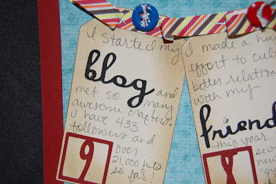
Here is a sample of my journaling with my key words. Note the dot on my i ~ I always lose them in my Xyron so I improvised. I also had a couple of mistakes in my journaling, but I just wrote right over them because that is how I normally write.
Here is the "10" border from Graphically Speaking up close.
It is kind of hard to see in this photo, but I used faux stitching around the letters and numbers so they stand out a bit.
And here is another look at the two pages together. This layout took me about 4 days to complete ~ I worked it in between work and other projects. I had to walk away several times and come back and almost gave up....glad I stuck it out!!!
Thanks Sheila for having me on your blog today!!































17 comments:
Lori, I love love how you created the border! I have been wanting to create something like this but the whole page, but you just gave me a great idea! Thanks! Gaby
What a wonderful layout! I really like the theme and agree that we should look back to the top things in the past year and reflect on them and scrap them as a permanent record of the year. Thank you for the great tutorial, I love the border and the reminder that Graphically Speaking is such a great cart. Thanks for being with us today.
"WOW" this is a very nice layout love the border I must try this one day!
Love it!!!!!! Very, very nice, thanks for sharing!
I just knew my secret sis was uber talented! Amazing as usual. Beautiful Lori!
What a super layout.
Lori... This is AWESOME. I love that format. Can be used for many different layout ideas.
Thanks for sharing.
Awesome! Love this page!
This is a great idea, I like to reflect on the year gone by in hopes to make the next even better. Thanks.
oh this is such a great idea.. Love it!!
Happy New Year ladies..
Hugs
Nanné
Love the layout. What a great idea!!
This is really such a great page idea!
I mean, some years are bigger then others, but just to document the year this way..really cool!
I also am a big fan of Graphically Speaking so I love seeing that cart used!
Day 3 of our New Year!!! Hope its been good so far!!! LOL!!!
What a great page and you did a super job with your tutorial love the title and the ten-ten ten border I will have to do something like this TFS
Lori, great job as usual!!! Love the layout!
OH, LOVE this!!! What a great use of the Gypsy! Love the colors too!
Hugs,
M
Awesome, awesome, awesome!!!! This is such a great idea!!!! I have to try this!!!! You are so talented!!!
I love it! Thank you for the simple directions. I can't wait to try this with my gypsy. Learning something new with you. Thanks for sharing.
Post a Comment